From brief to 30 screens in one working session.
A Philadelphia hobby-discovery app, designed with Claude as a design and build partner. This page maps what we actually did against the classic design process, including the places where we skipped ahead, looped back, or haven't gotten to yet.

Dabble Collective helps people in Philadelphia find a hobby worth trying once. It curates beginner-friendly, low-commitment classes that already exist in the city, pottery, climbing, printmaking, dance drop-ins, so deciding what to do with a free night takes minutes instead of an evening of searching.
Dabble doesn't run the classes. Studios do. Dabble curates them, and over time lets you book without leaving the app.
The primary persona. One or two free nights a month, and she needs to feel the time was well spent. Single sessions, not multi-week series. When a tradeoff comes up, she wins.
Secondary. Here for the social side. Cares about the vibe of a room, whether it works for a group, and how fast a listing shares to a group chat.
Tertiary. Wants real studio time, not an intro class. Served by filters and tags, open studio and intermediate, rather than by the core flow.
Booking commissions across three tiers: Partner studios book natively, Connected studios through their own platform, Listed studios in an in-app browser. Featured slots are labelled and still have to pass curation.
Nothing was handed to me. No brief, no team, no research budget, and no client to approve anything. I wanted to see how far a designer and an AI could take a real product in one working session, so I picked a real problem rather than a toy one: Philadelphia is full of beginner classes, and there is no good way to pick one for a free Tuesday night.
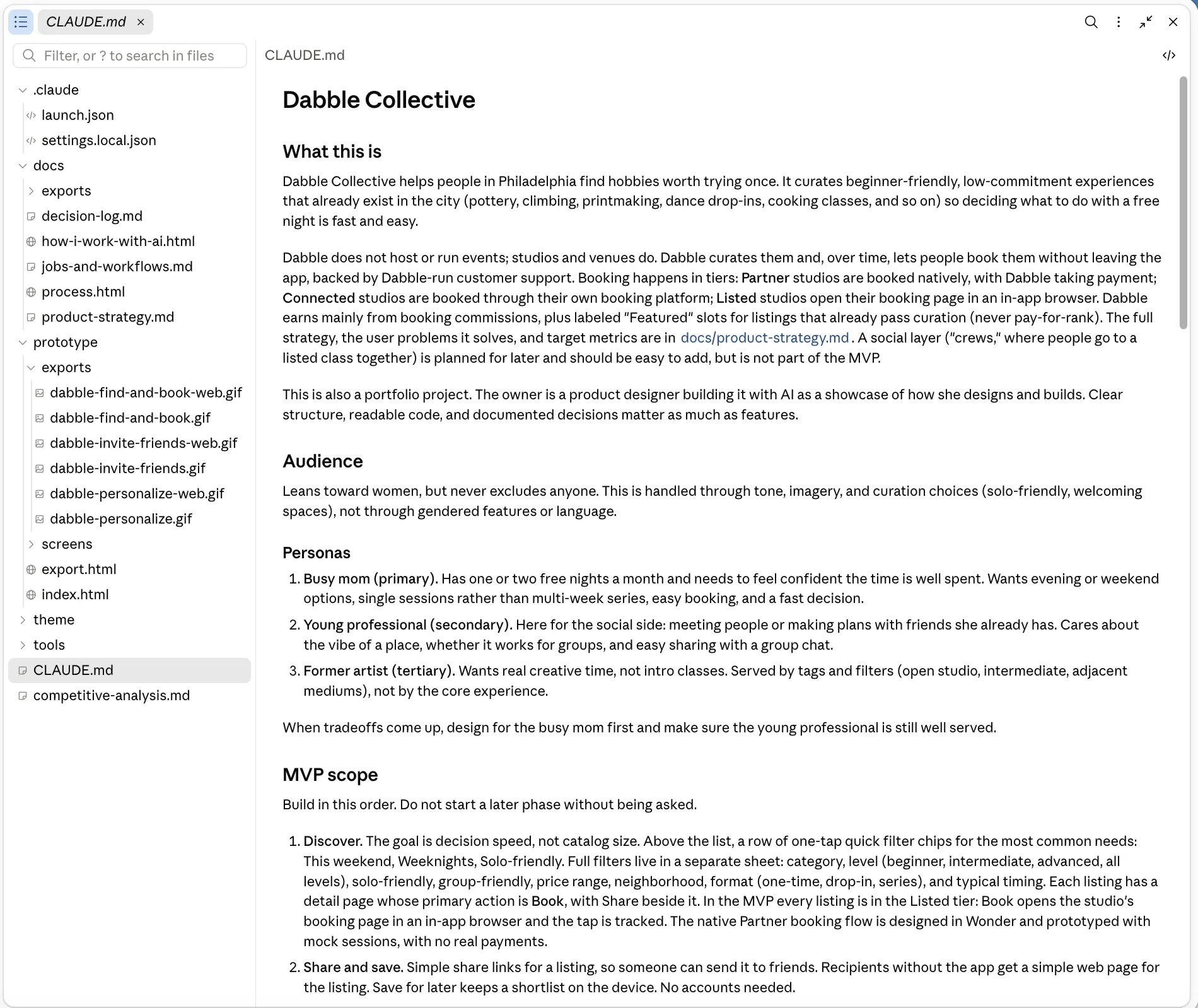
The first thing I wrote wasn't a prompt. It was CLAUDE.md: the personas, the MVP scope, the brand rules, what was out of scope, and how I wanted to be worked with. Then I connected Wonder as the design canvas and Mobbin as the pattern library, and started.
Nothing below was reconstructed afterwards. The decision log was written as we went, including the entries where I overrode Claude.
I make the calls. Claude does the legwork. The split is what makes the speed possible without giving up authorship. Claude never picks the direction. It brings options, evidence and a first draft, and I choose, push back, or override.
Reference for how proven apps behave.
The canvas for designing and reviewing screens.
The living brief.
The single source of style.
Strategy, workflows and decisions.
It wasn't a straight line, and that's the point. Because each round was cheap, we could go back a stage the moment something felt off. These are the moments that changed the work, and where it stands now. The biggest loop happened mid-design, when the screens looked good enough to raise the real strategy question.
Wrote CLAUDE.md with personas, MVP scope and working rules, and connected Wonder and Mobbin. Chose a native app built with Expo, then answered the brand questions Claude put to me: editorial, upscale, welcoming, never crafty, no pinks or SaaS blue.
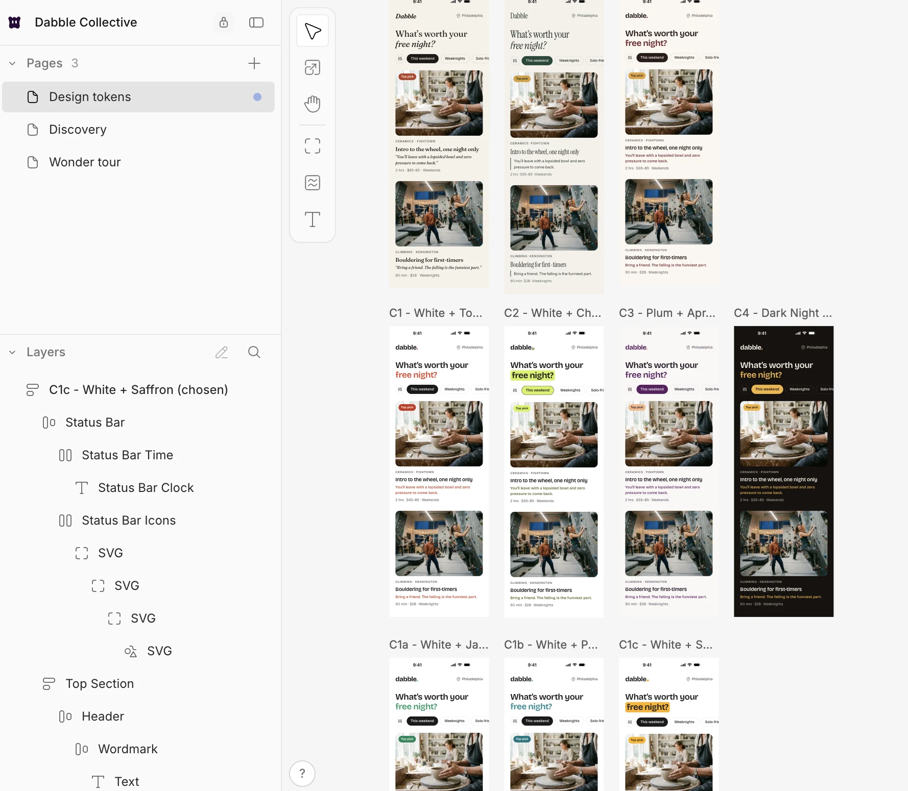
Claude mocked up three complete brand directions side by side. I took direction C and threw out all three palettes as too brown and too serious. Four more rounds, then I questioned red because it reads as food. Saffron won, and its Bumble resemblance was named and accepted on purpose.
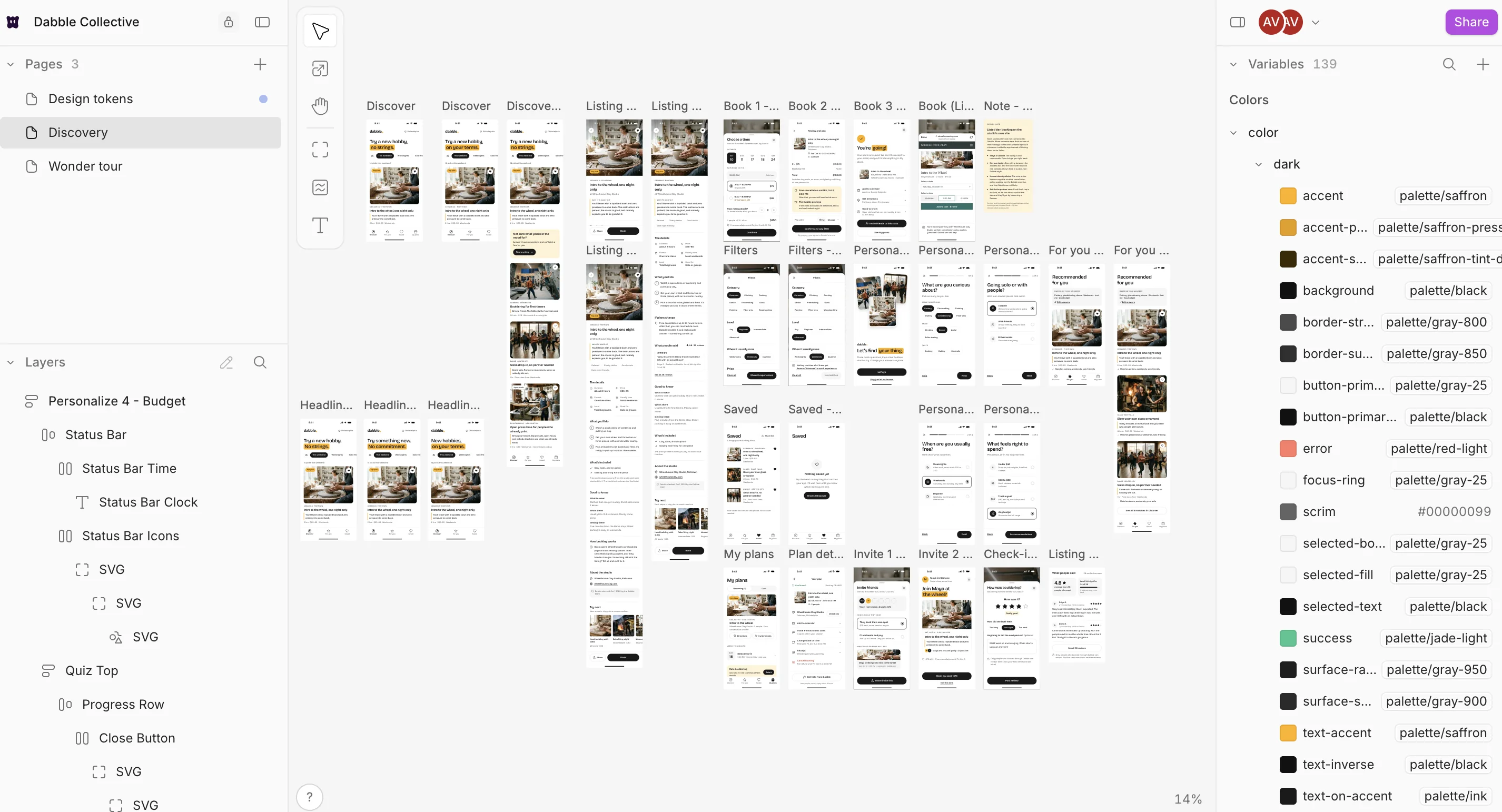

Discover and Detail, built by Claude directly in Wonder over an MCP connection, against a token file synced as variables so the designs and the future code can't drift. Six headline variants before "Try a new hobby, no strings," which was my override.
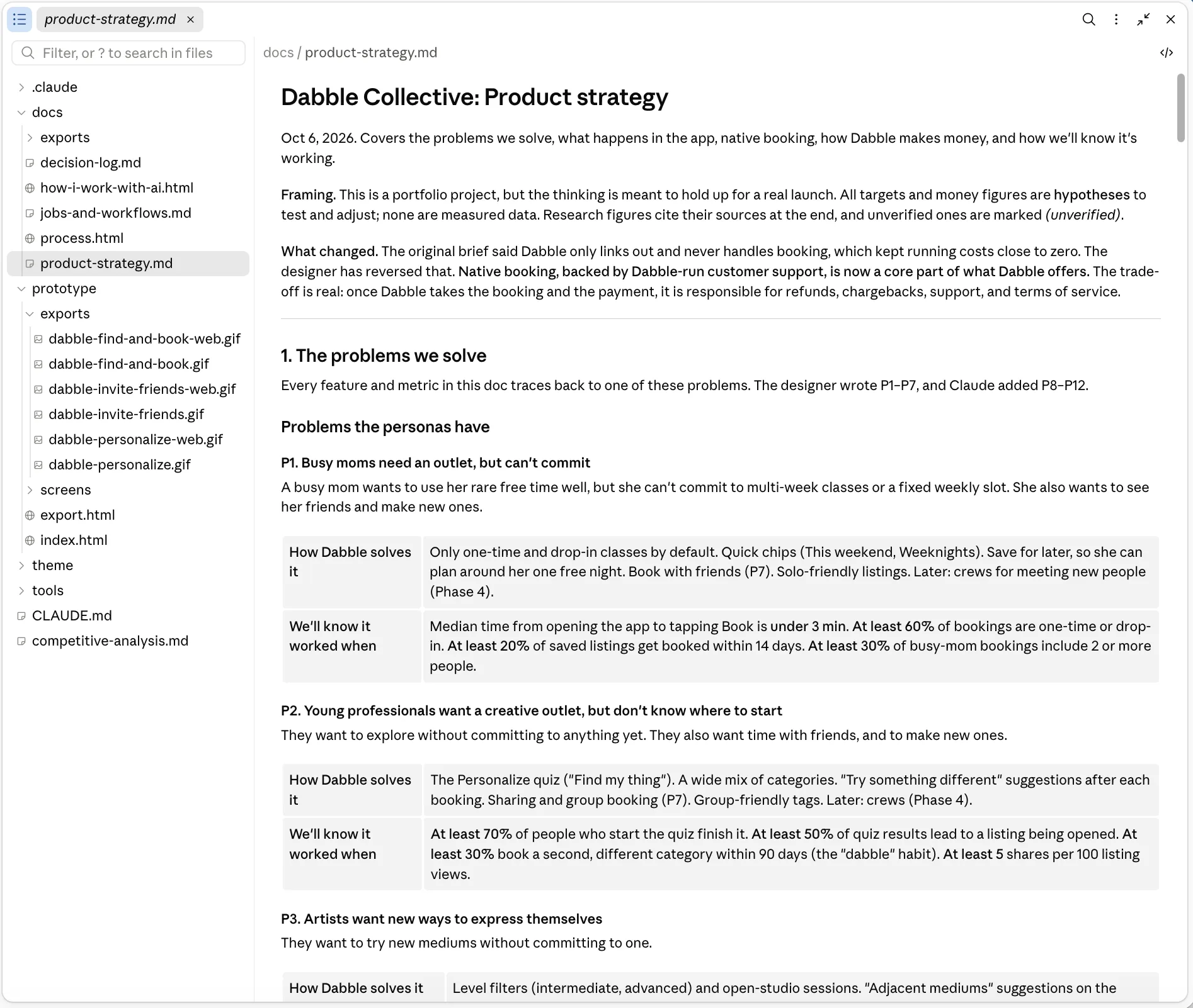
The screens looked good enough to raise the real question, so I stopped designing to rethink the business: keep people in the app, offer native booking with Dabble support, and plan how Dabble makes money. Claude researched and drafted against that, which added 12 user problems, each with a metric.

Pick a time, review and pay, confirmed, plus filters, the quiz, For you and Saved. A confusing studio page got a realistic redesign. I renamed "Your picks" to "Recommended for you," since the user didn't pick them. My plans became a fourth tab, which I chose over Claude's idea to merge it.
I overrode the simple check-in, which meant Claude had to redefine the North Star metric to match: good nights booked, measured as bookings rated 4 to 5 stars.
I asked Claude to check every screen against the brief and the strategy. It found that Detail promised free cancellation that Listed studios can't offer, plus missing content and an underserved persona.
Claude's fixes brought Detail versions by booking tier, the artist path and vibe tags. Saffron got pulled back too far along the way, until I set the rule: one guiding moment per screen.
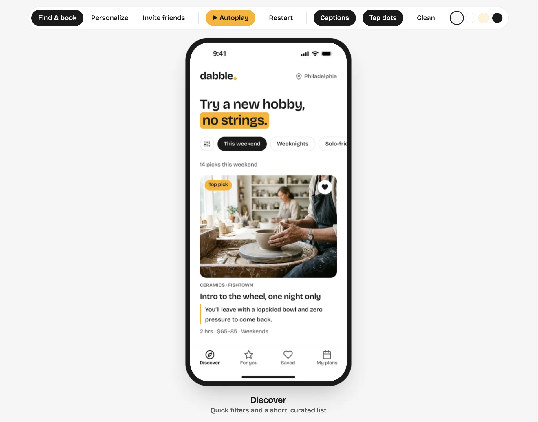
Designed the two remaining quiz questions, then had Claude build a tappable prototype from the Wonder screens, with push and sheet transitions, real scrolling and an autoplay mode for recording. Three flows run end to end today: find and book, personalize, and invite friends.
The prototype is a checkpoint, not an ending. Each round builds on what's already there: next is the shared-listing web page with its empty and error states, then an Expo app from these same screens and tokens, with sample Philly listings. The brief, the tokens and the decision log carry forward, so nothing restarts.
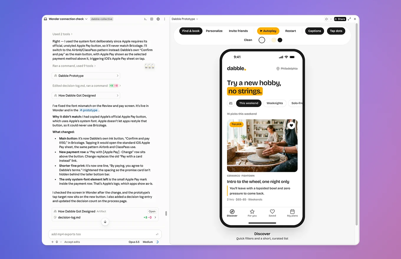
The screens are not static. These are the three flows running in the prototype, recorded end to end.
Every stage left something behind, which is what makes a long session reviewable afterward rather than just fast. These four are the ones that did the most work.
CLAUDE.md — the living brief: what Dabble is, who it serves, and the MVP build order.
product-strategy.md — every problem paired with a solution and the metric that would prove it.
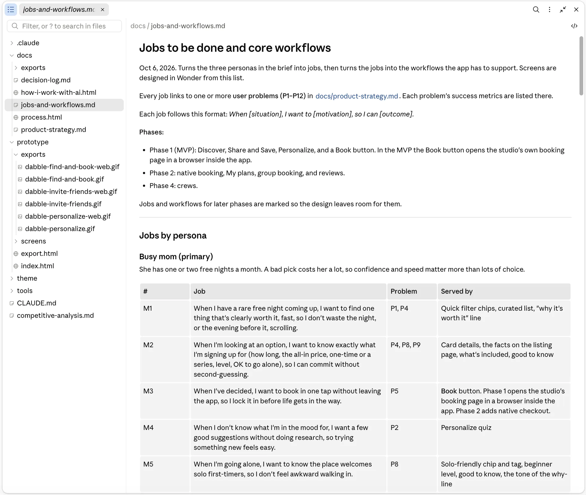
jobs-and-workflows.md — jobs tagged to problems, and the feature serving each one.
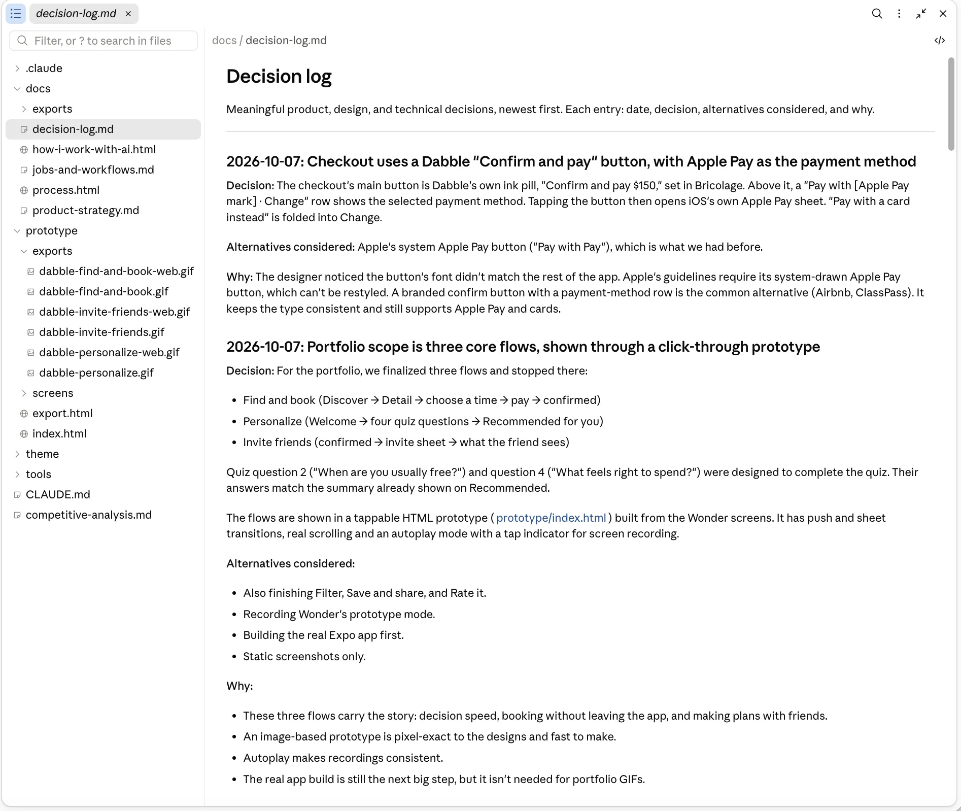
decision-log.md — each entry records the call, the alternatives, and why.Speed came from structure, not shortcuts. Six things did the work.
Ten palettes and six headlines meant I could judge choices side by side instead of imagining them.
Competitors' pricing, booking APIs and app patterns were researched at the same time and brought back with sources.
Every screen reads from the same tokens, so a palette decision changes the designs and the future code together.
14 entries record what we chose, what we didn't, and why. That's how a single long session keeps its context, and how the work shows its thinking.
The headline, the four tabs, star ratings, native booking, "recommended" wording and saffron balance were all my calls, several against Claude's suggestion.
Reopening strategy halfway through took one conversation, not a sprint, so we did it instead of shipping around the problem.
The fast part is done. What's left needs people outside this conversation, and until that happens this is expert review rather than validated design.
Short interviews with busy parents and young professionals in Philly, to test the 12 problems against real lives.
5–8 people who fit the personas. Target: 80% find a class for a free night in under 2 minutes.