SEPTA App Redesign
ROLE
UX Design Student
DURATION
Original Design 2015
Latest Iteration 2021
SUMMARY
A project for a Mobile UX class at Moore College of Art and Design. The task was to redesign a mobile app by following the UX design process.
*This project has no direct affiliation with SEPTA
Public transit can be stressful, confusing, and frustrating…
But it is an essential part of millions of people’s lives. SEPTA (Southeastern Pennsylvania Transportation Authority) is the main public transportation service in the Greater Philadelphia Area and has long been one of the only ways Philadelphians could travel locally. However, with ride-sharing apps growing in popularity, it is now more crucial than ever for SEPTA to become a mobile-friendly service to accommodate their customers' lives.
My mission was to create an app for SEPTA that gives frequent riders the ease and convenience they need for their daily commute, weekend social life, and everything in between.
Defining Our Core Users
I evaluated the top three most common users of SEPTA’s services and researched their top needs and wants when they are traveling. These three personas were my north star when making design decisions and creating user flows.
-

Daily Commuter
“I want my commute to work and back home to be reliable and stress free.”
-

Urban Explorer
“I enjoy finding new spots to hang out in the city on my own and with friends.”
-

City Dweller
“I use public transit almost every day to get to all of my destinations.”
Convenience is King
-
Location
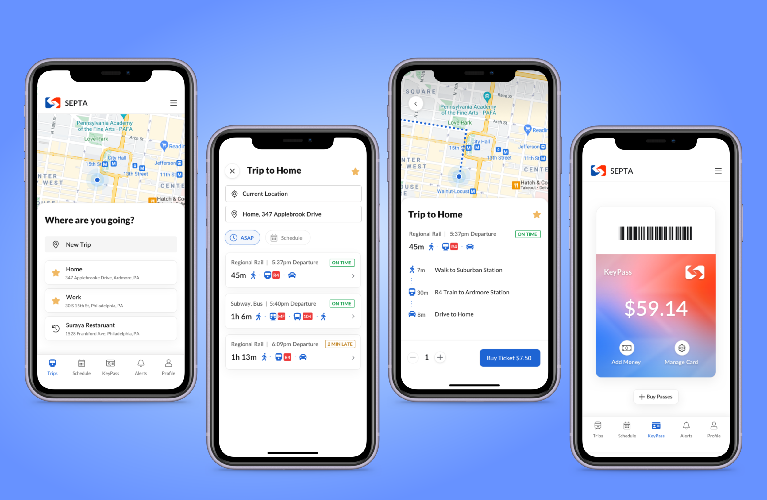
Using GPS to know the user's location is extremely valuable when the user is discovering different routes they can take to get to their desired destination. Being able to save destinations that you visit frequently saves a large amount of time for the daily commuters and dependent riders.

-
Compare Routes
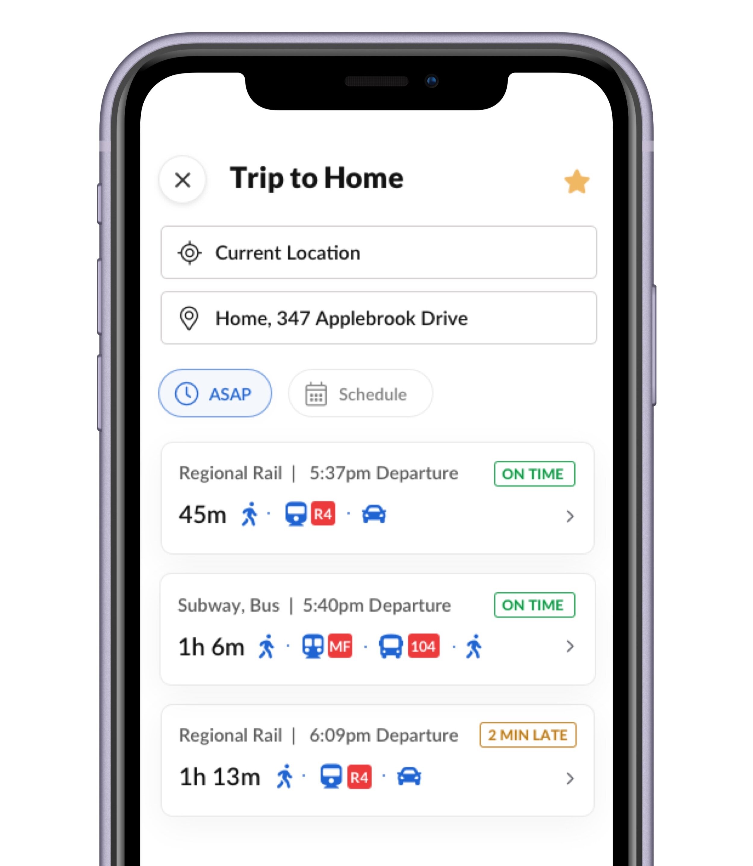
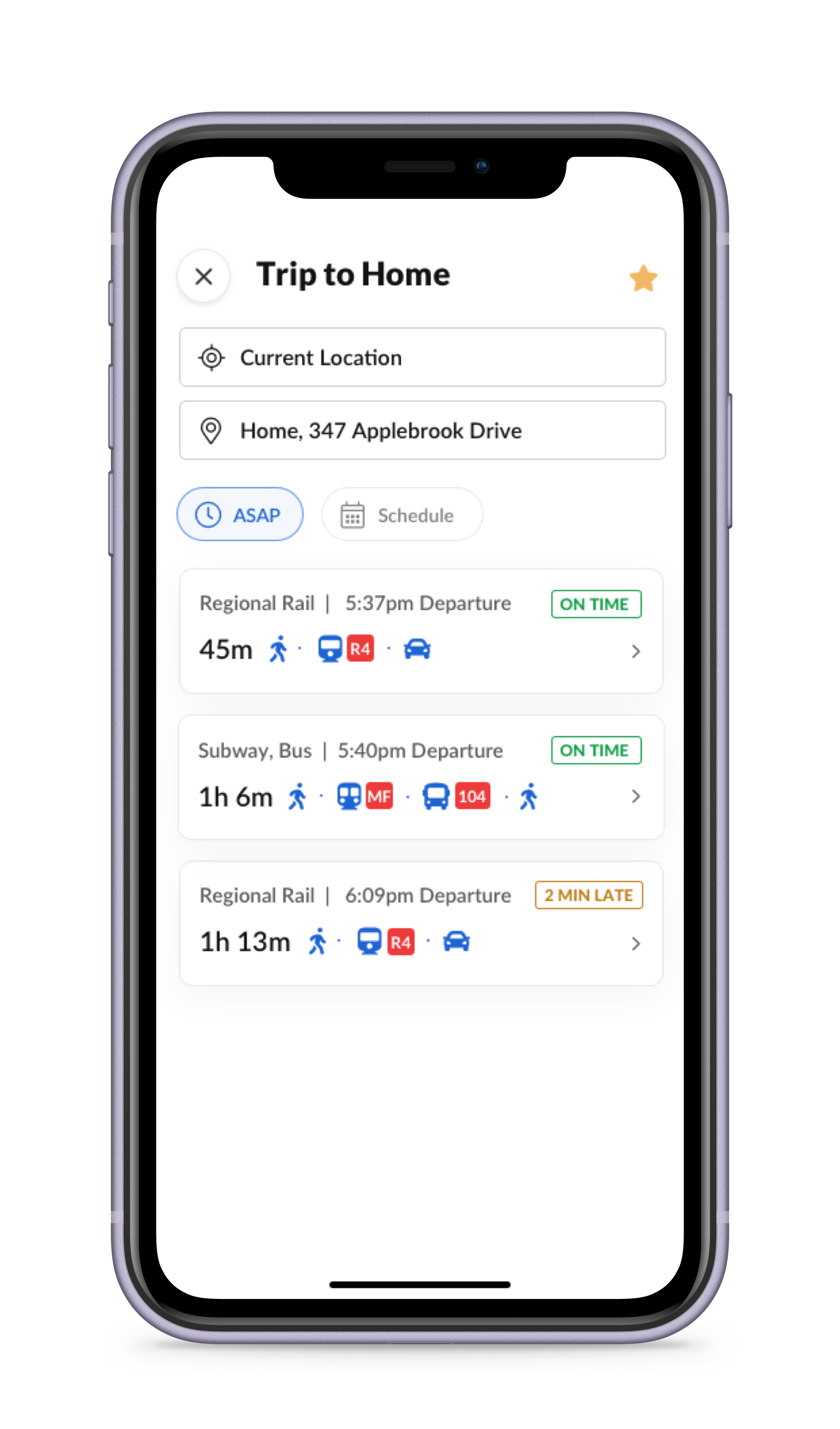
Being able to compare different routes to get to the one destination empowers the user to make better travel decisions and also discover their options. Showing a status update on each route provides value for the user to still utilize the app even when they have their routes memorized.

-
Paperless
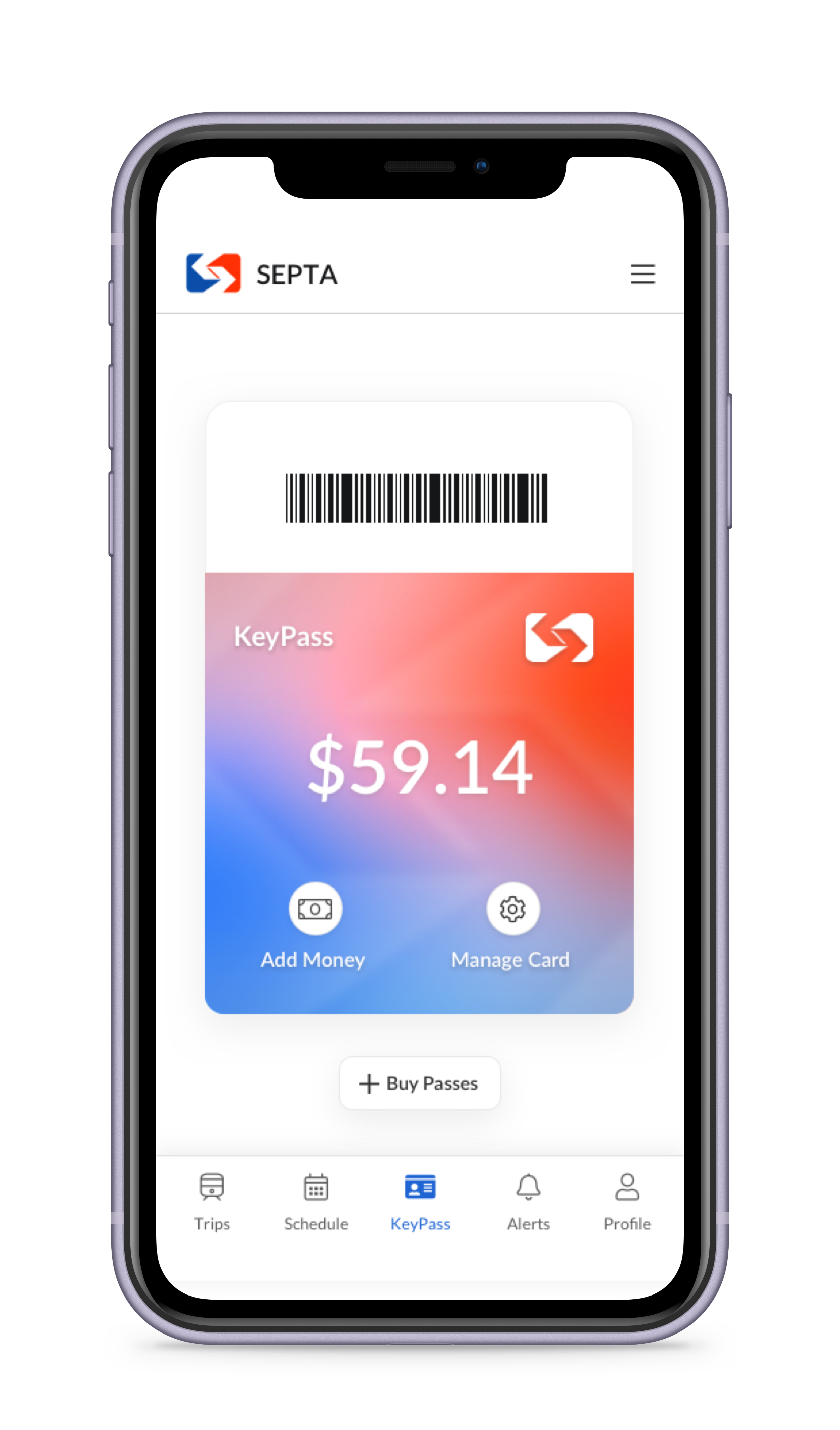
Being able to pay for your fare on the app is a huge way SEPTA can level up to the convenience that ride-sharing apps already have in place today. Riders will no longer have to worry about keeping cash on hand or keeping track of their loose tickets.

Booking a Trip Home
As part of my final deliverable for my project, I designed a user flow of a daily commuter booking their trip home from work.


Measuring Success
To measure the success of this redesign, I would work with the research team to reference the following KPIs:
Task completion rate - how many tickets were purchased through the app
Increased app engagement
Increased revenue in digital sales
Increased app retention
Churn rate - How many customers download the app but then go back to using their previous methods
Retrospective
This project was my first deep dive into the UX process back in 2015. I continue to use this design exercise as a way to track my personal design growth. I hope to continue to build upon my designs to create the entire app experience.


