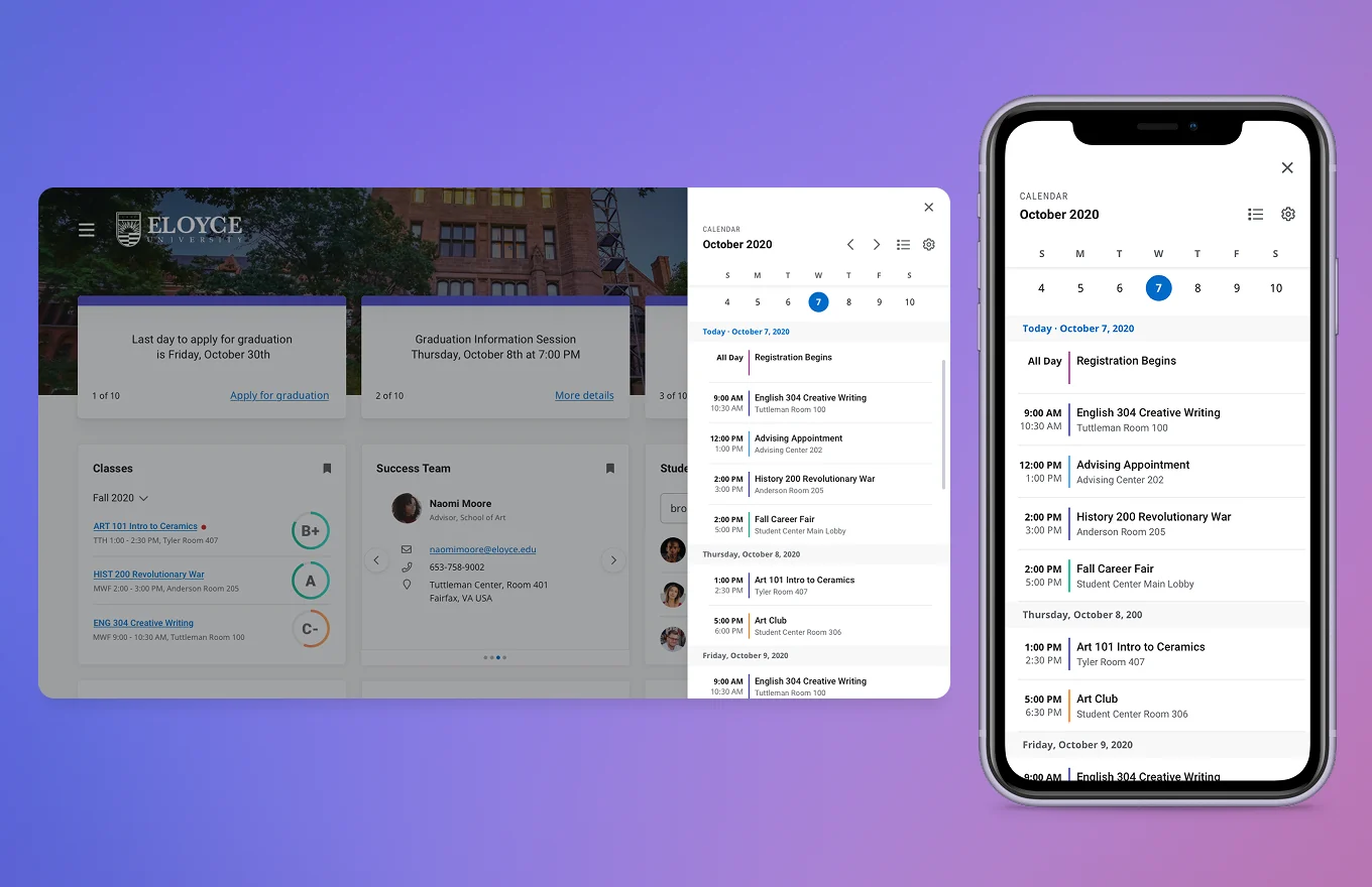
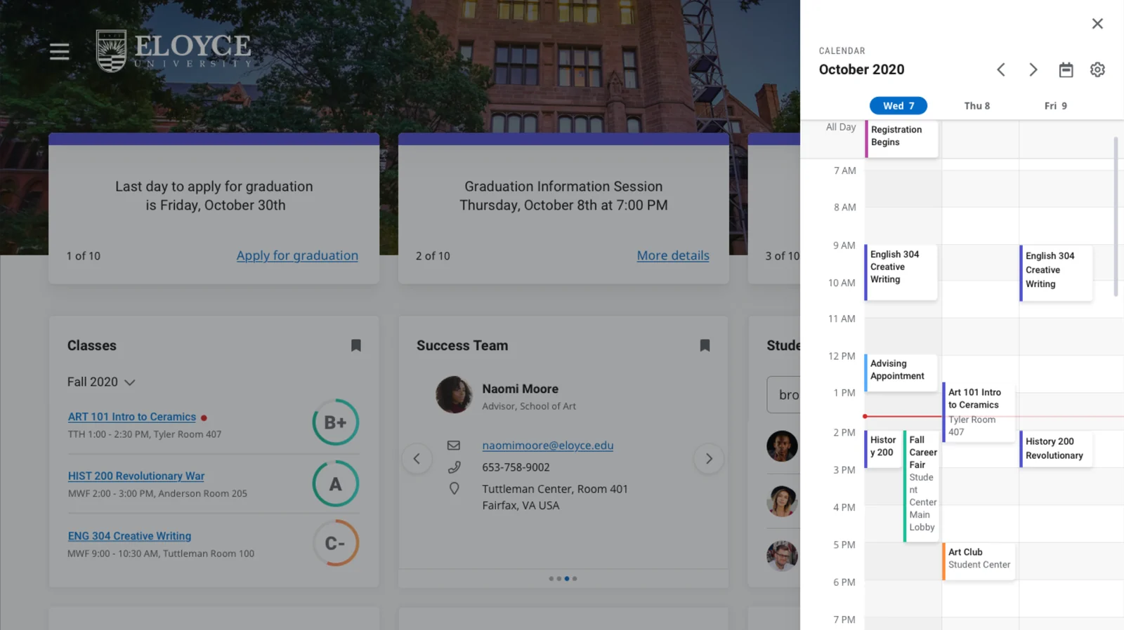
Aggregating every institution calendar into a single, integrated, personalized view inside Ellucian Experience (now Central Workspace), accessible on any device, always up to date.
Most institution calendars are spread across multiple links and files that are hard to keep track of in one place. It is also impossible to know if these calendars are staying up to date, since they usually require a manual upload by an administrator to reflect any updates.
The Goal: Surface all events inside a single, unified calendar directly on the Ellucian Experience dashboard.
We defined core persona needs through diary studies, journey maps, surveys, usability testing, design sprints, and development partner groups. When it came to institution calendars, our two core personas, Students and Staff, shared very similar goals:
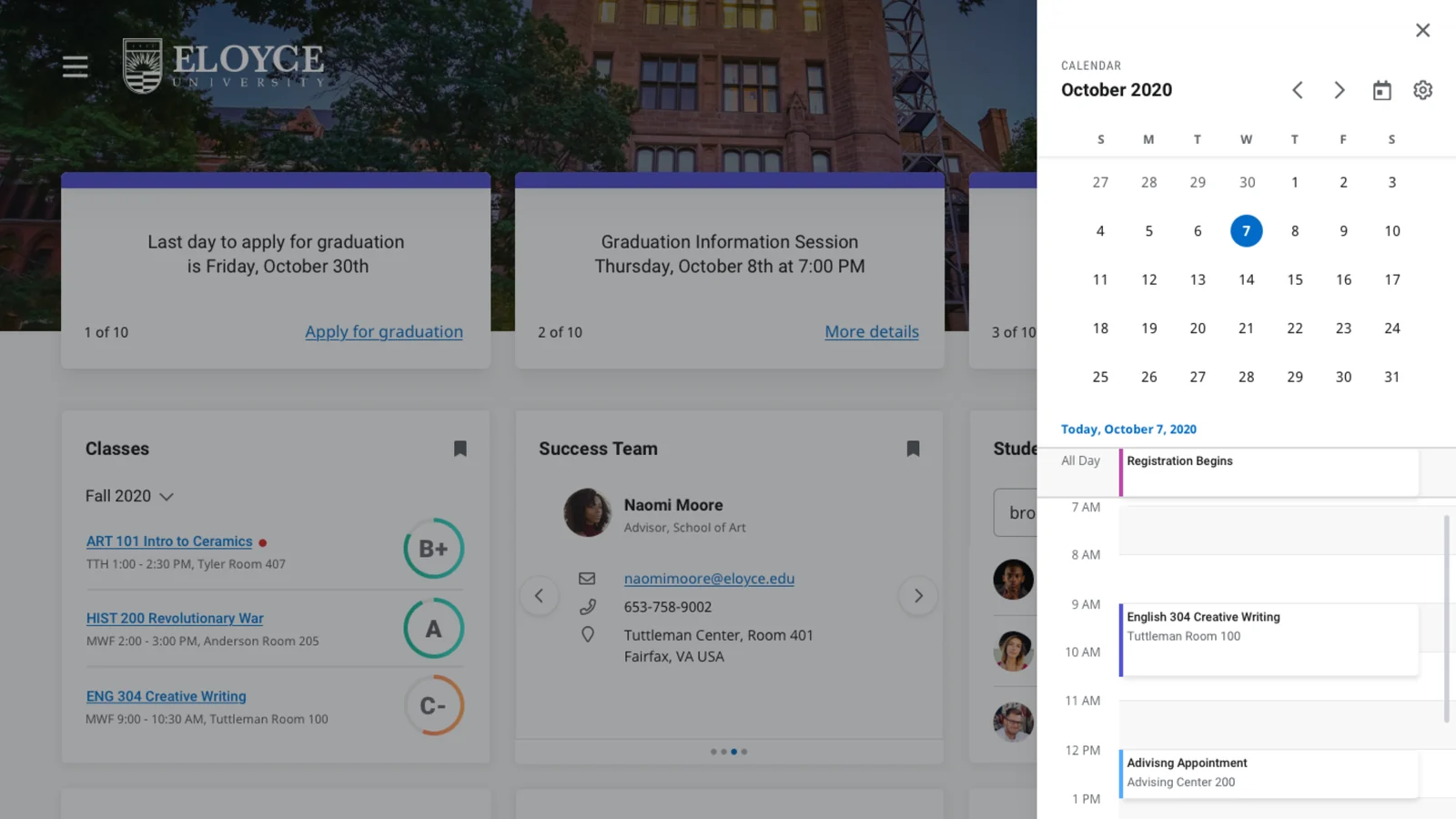
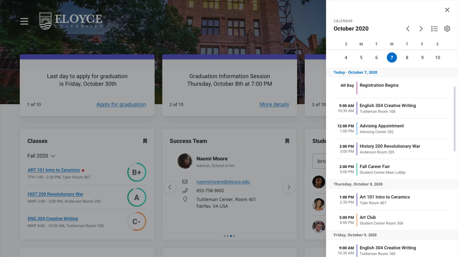
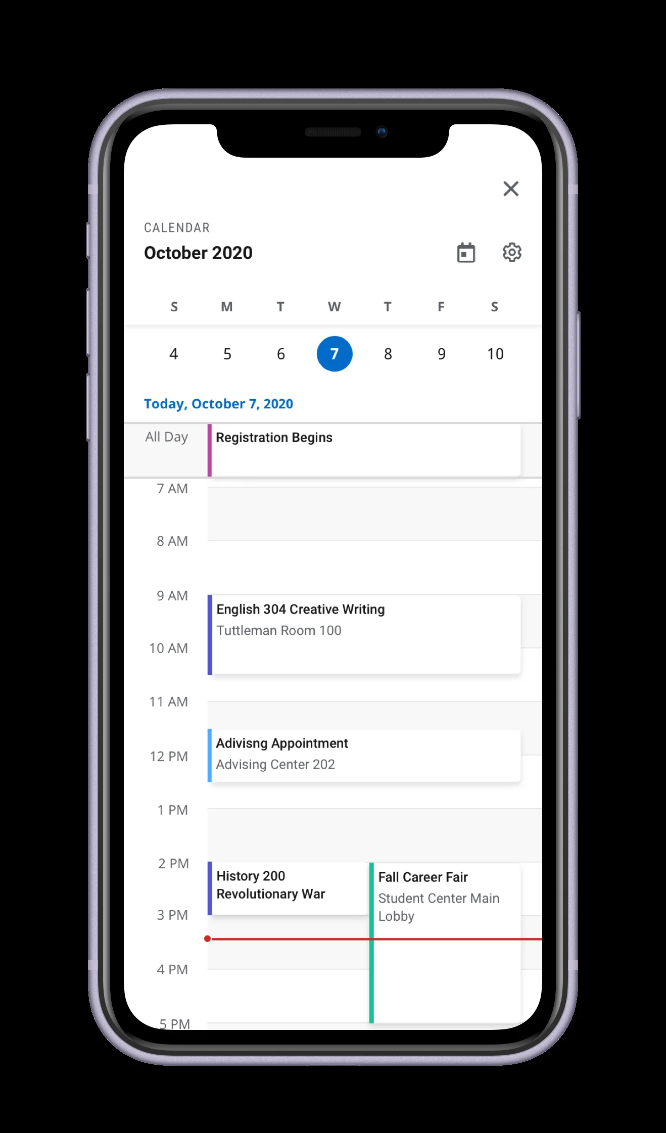
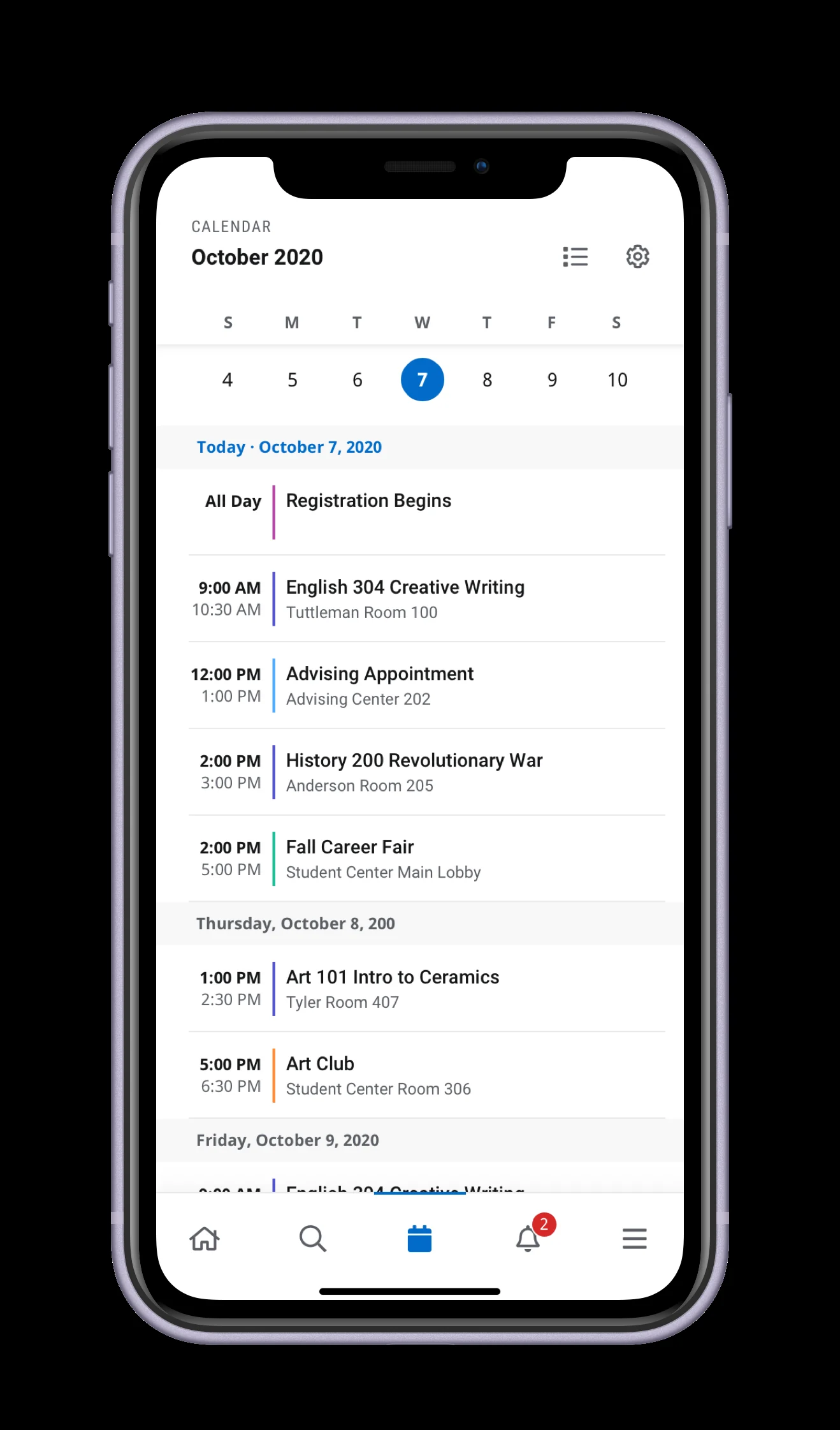
We wanted to understand how personas used calendars, what devices they relied on, and which layout (Day, List, or 3-Day) genuinely matched their mental models.
Day view won consistently across both personas. Because the 3-Day view was the least preferred by users and required significantly more engineering complexity, shipping two high-quality views for the MVP was far more valuable than rushing three.
Research gave us the data to make that call confidently, treating the descope not as a compromise, but as a strategic decision. The 3-Day view was fully designed and validated, but deprioritized for a future iteration until the platform could support it cleanly.
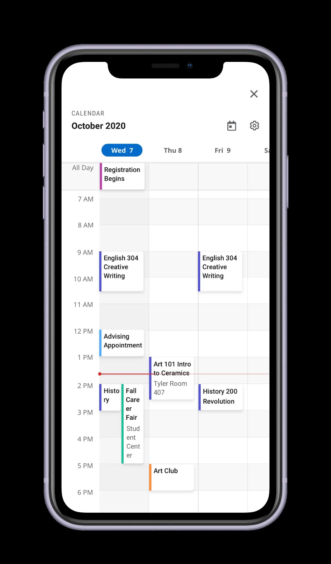
This project taught me that research is often most valuable when it tells you what not to build. The 3 day view was the most expensive to engineer and the least wanted by either persona, and having clear data made cutting it a quick, confident conversation rather than a contested debate. Protecting engineering bandwidth to ship a stronger MVP on time is a strategic decision, and making it with evidence instead of instinct is a habit I have carried into every project since.