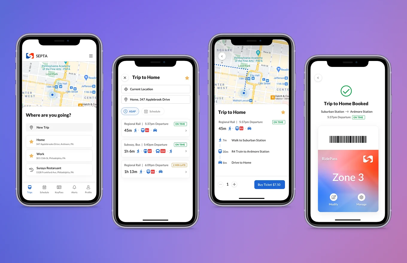
A mobile app concept giving frequent SEPTA riders the ease and convenience they need for their daily commute, weekend social life, and everything in between.
Note: This project has no direct affiliation with SEPTA. It was completed for a Mobile UX class at Moore College of Art and Design and later revisited to showcase visual design craft and mobile UI evolution.
Public transit can be stressful and confusing, yet it remains an essential part of daily life in the Greater Philadelphia area. With ride-sharing apps raising consumer expectations, it became more crucial than ever for SEPTA to offer a frictionless mobile experience.
The Mission: Create a concept app for SEPTA that gives frequent riders the speed and convenience they need for their daily commute, weekend social life, and everything in between.
I evaluated three primary rider archetypes to serve as my North Star for user flows and interface decisions:



Three core principles shaped every decision in the application:
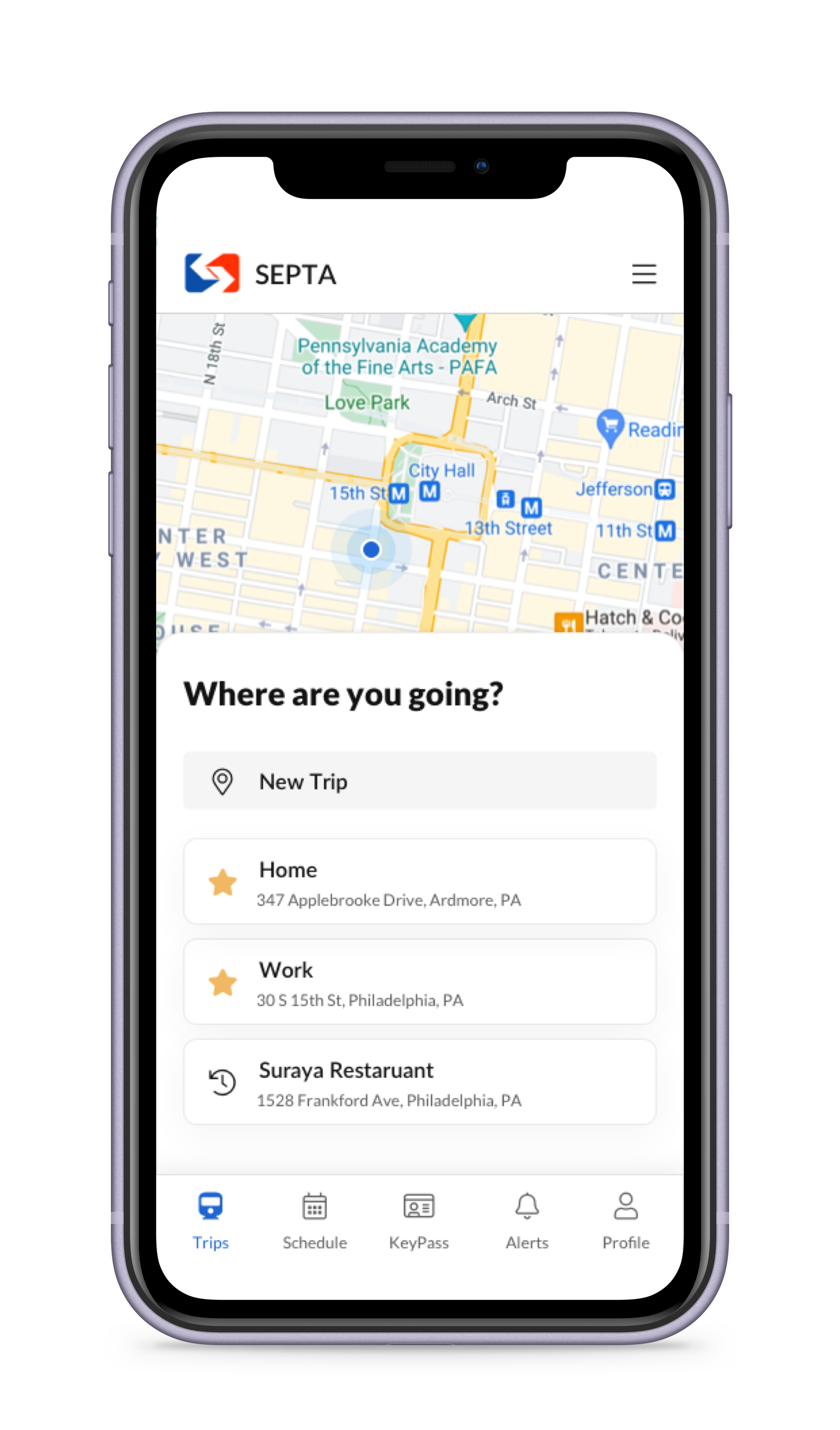
Leveraging GPS for contextual route discovery and allowing users to save frequent destinations to save time.
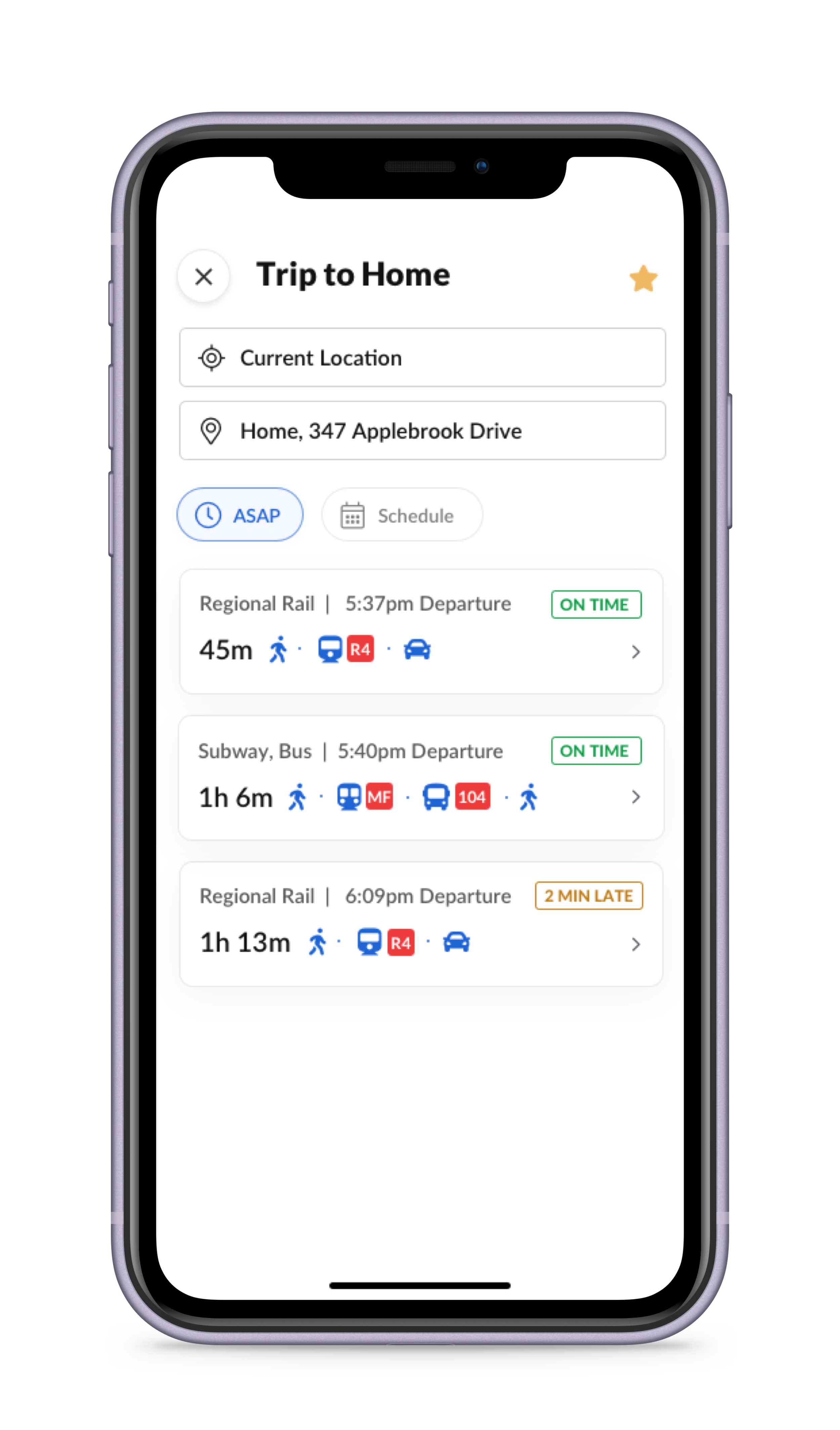
Empowering riders to compare options side-by-side with live status updates, even for familiar routes.
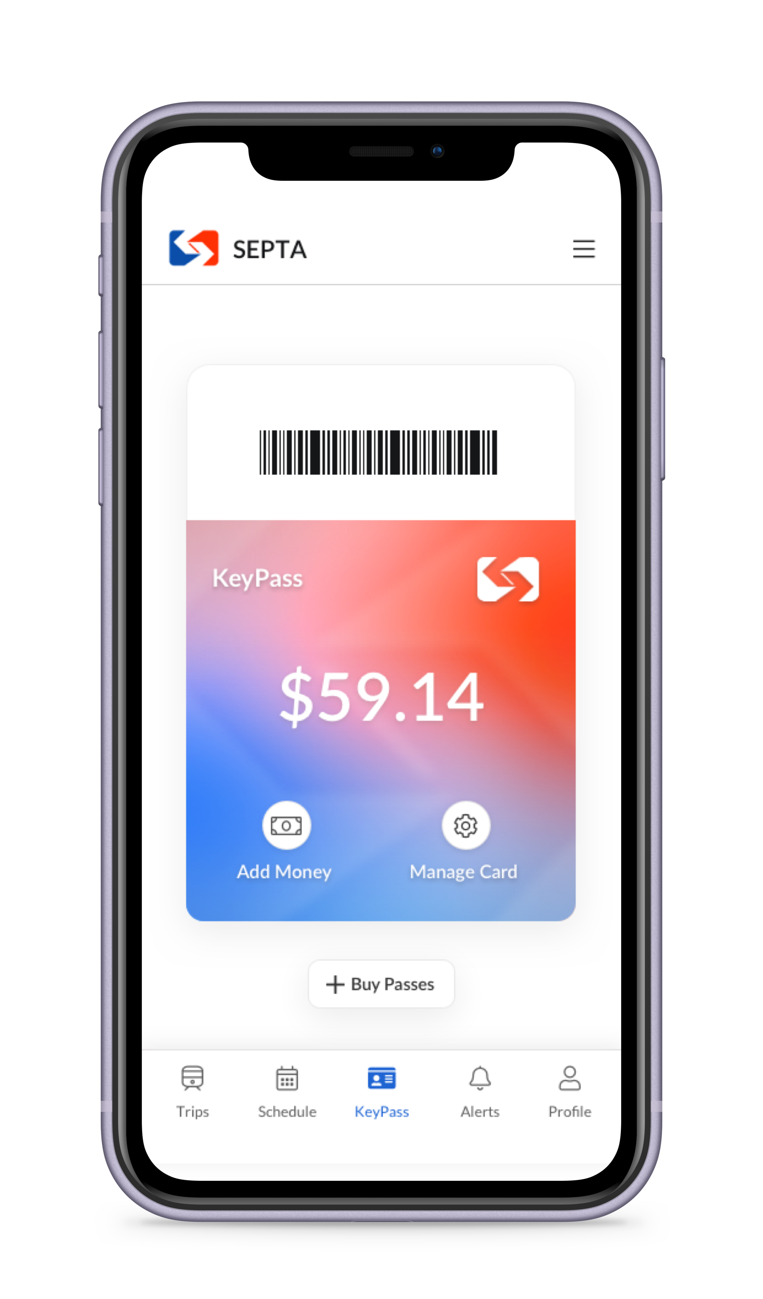
Integrating ticket purchasing and fare balances directly into the app so riders no longer need cash or loose paper tickets.
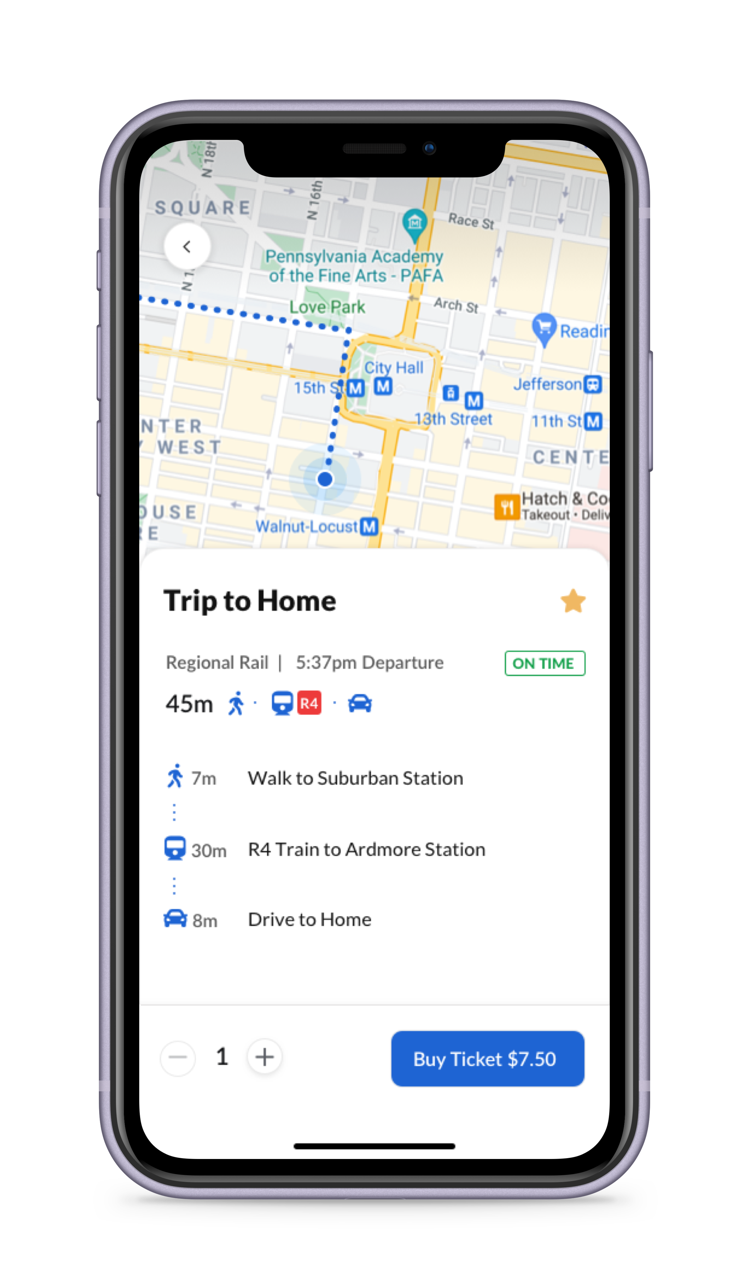
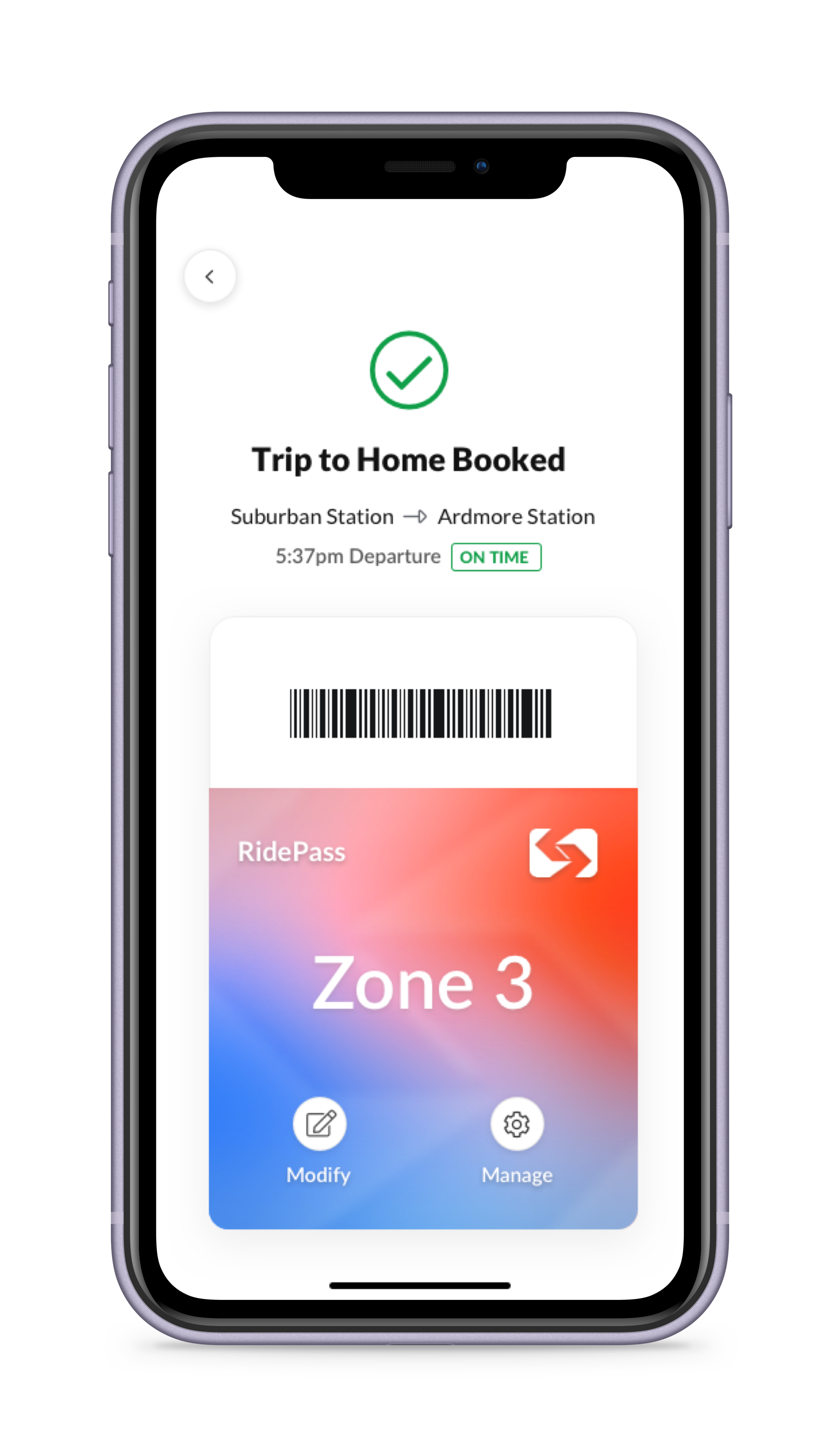
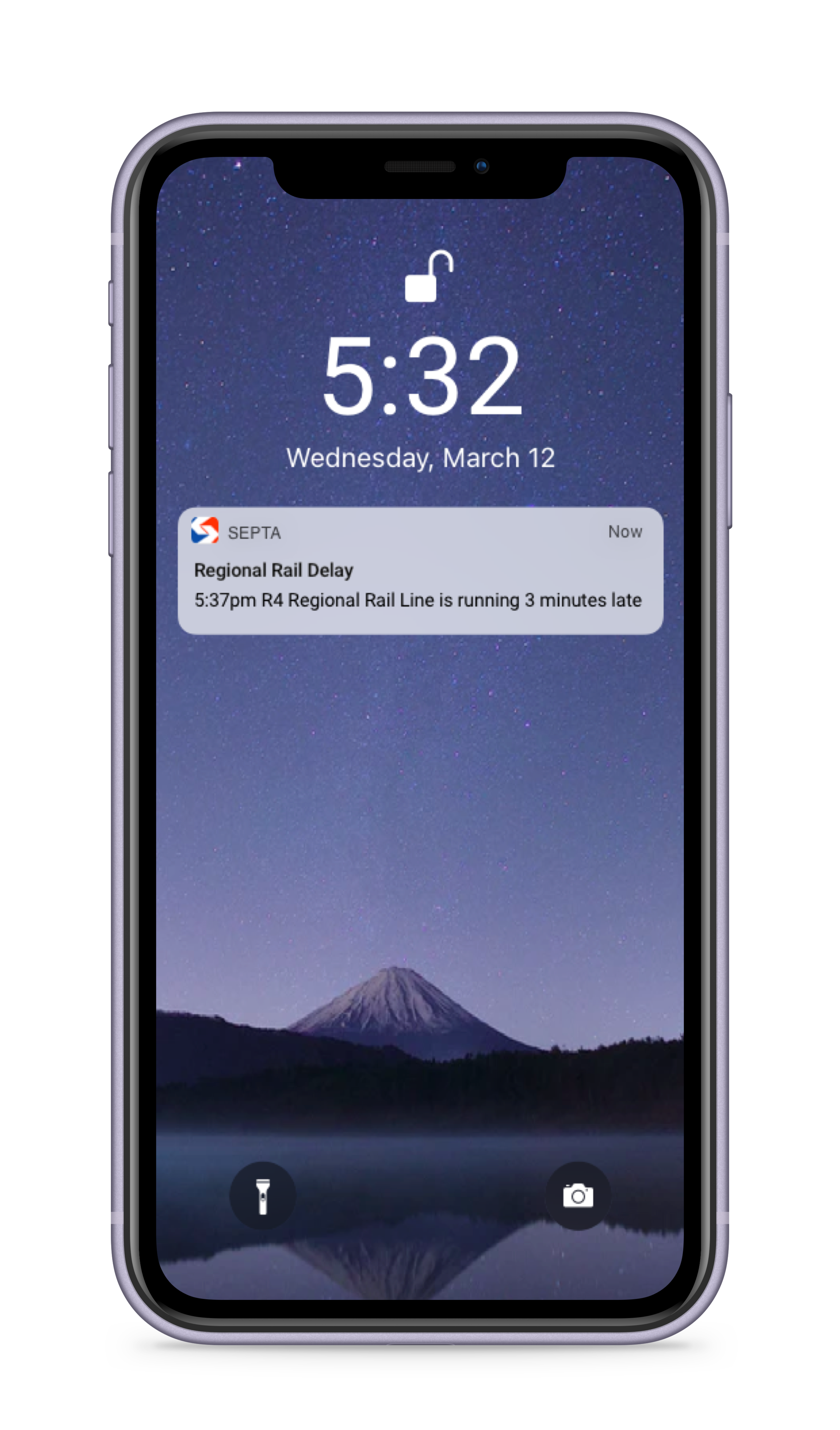
As a core deliverable, I designed a complete end-to-end user flow showing a daily commuter booking their trip home from work while applying all three principles in sequence.
To evaluate the impact of this redesign in a real-world scenario, I defined key performance indicators to track:
This project was my initial deep dive into the digital design process back in 2015. I periodically revisit this design exercise to track my own visual and structural growth, using it as a canvas to explore mobile craft.